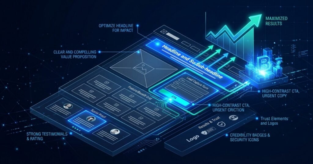
Landing Page Development: Technical Best Practices That Convert
A landing page is not a smaller version of your homepage — it’s a fundamentally different kind of page, built around a single, deliberate goal rather than the many competing goals a homepage has to serve. Where a homepage introduces your entire business, a landing page exists to get one specific type of visitor, arriving with one specific intent, to take one specific action — download, sign up, book a call, or buy. Every technical and design decision on that page should be judged against whether it helps or hurts that single conversion. That’s a genuinely different design brief from a homepage, and treating a landing page as just a shorter homepage is one of the most common reasons paid campaigns underperform even with a healthy ad budget behind them.
At Webtoz, landing pages are treated as a distinct discipline from general website design — closely tied to the performance principles in Core Web Vitals and site speed, since a landing page funded by paid traffic that loads slowly is quite literally burning ad spend with every extra second.
In this guide, we’ll cover the technical foundations every high-converting landing page needs, how to structure the core conversion elements, the tracking and analytics setup that lets you actually measure performance, and the most common technical mistakes that quietly suppress conversion rates.
📖 In This Guide
- What Makes a Landing Page Different From a Homepage
- Technical Foundations of a High-Converting Page
- Core Conversion Elements and Best Practices
- Tracking and Analytics: Measuring What Matters
- Setting Up A/B Testing the Right Way
- Common Landing Page Mistakes That Kill Conversions
- How to Build a Landing Page (Step-by-Step)
- Final Thoughts: One Goal, Zero Distractions
1. What Makes a Landing Page Different From a Homepage
A homepage has to serve investors, job candidates, existing customers, and brand-new prospects all at once — which necessarily means compromise. A landing page has no such obligation. It’s built for one traffic source, one audience, and one action, which means full navigation menus, footer link farms, and unrelated content are actively working against its purpose rather than serving it. This focus is what allows a well-built landing page to convert at multiples of what a general page ever could for the same offer.
This is also why sending paid traffic to your homepage instead of a dedicated landing page is such a common and costly mistake. A homepage is trying to serve too many audiences at once to speak directly to the specific promise made in a specific ad — the visitor lands, doesn’t immediately see what they clicked for, and leaves. A landing page eliminates that mismatch entirely by design.
Should landing pages have a full navigation menu?
Generally, no — for paid campaign landing pages especially, removing the main navigation is one of the highest-impact changes you can make. Every link away from the page is an exit ramp from the one action you actually want. A minimal header with just your logo, and no other navigation links, keeps visitor attention exactly where it needs to be.
How long should a landing page actually be?
Long enough to answer every objection a visitor is likely to have before asking them to convert, and not a word longer. A simple, low-commitment offer — downloading a free guide — needs very little persuasion and can convert well on a short page. A higher-commitment offer, like a significant purchase or a demo request, typically needs more supporting detail, social proof, and objection-handling before a visitor is ready to act. Length should be a consequence of the offer, not an arbitrary target.
2. Technical Foundations of a High-Converting Page
Fast Load Time
Every extra second of load time directly costs paid traffic conversions.
Mobile-First Layout
Most paid social and search traffic arrives on a phone — design accordingly.
Minimal Navigation
No exit ramps away from the single conversion goal.
Single Clear CTA
One primary action, repeated, not competing with multiple offers.
None of these foundations are optional extras to add “if there’s time” — a landing page missing even one of them tends to underperform regardless of how strong the copy or design is elsewhere on the page. They’re the load-bearing walls the rest of the page’s persuasive work depends on.
3. Core Conversion Elements and Best Practices
Notice that none of these elements exist in isolation — a strong headline that doesn’t match the CTA, or social proof placed far away from the form it’s meant to reassure, loses most of its effect. The sequencing and proximity of these elements on the page matters almost as much as their individual quality.
4. Tracking and Analytics: Measuring What Matters
A landing page you can’t measure is a landing page you’re optimising blind. Proper tracking means firing a conversion event the instant the goal action completes — not just a page load — connecting that event to your ad platform’s conversion pixel, and setting up scroll-depth and form-field-abandonment tracking so you can see exactly where visitors drop off, not just that they did. This data is what separates genuine optimisation from guessing which headline “feels” better.
It’s worth double-checking that tracking fires correctly before spending a single dollar of ad budget against the page — a broken conversion pixel can run silently for weeks, quietly reporting zero results for a page that’s actually converting perfectly well, leading to a perfectly good campaign getting paused for entirely the wrong reason.
5. Setting Up A/B Testing the Right Way
Testing one landing page variant against another only produces trustworthy results if it’s set up correctly from a technical standpoint. That means testing one variable at a time — headline or CTA text, not both simultaneously — running the test long enough to reach statistical significance rather than calling it after a handful of conversions, and making sure both variants load with equal speed so performance differences don’t quietly bias the result. A poorly configured test can confidently point you toward the wrong conclusion.
It’s also worth resisting the temptation to test too many things at once out of impatience. A page with five simultaneous variants split across a modest amount of traffic will take far longer to reach a confident result than two clean variants tested back to back — slower, more disciplined testing consistently beats faster, noisier testing in the long run.
6. Common Landing Page Mistakes That Kill Conversions
Most of these mistakes are individually survivable — a page with one of them can still convert reasonably well. The real damage tends to happen when several stack together on the same page, each one quietly compounding the drop-off caused by the last.
- Full site navigation left in place: Every menu link is a way for the visitor to leave without converting.
- Message mismatch: The headline doesn’t match what the ad or link promised, causing instant confusion.
- Long, generic forms: Asking for information you don’t actually need yet lowers completion rates.
- Slow load times on paid traffic: Every second of delay burns ad spend on visitors who never even see the offer.
- No conversion tracking configured: Optimising a page you can’t actually measure is optimising by guesswork.
- Multiple competing CTAs: Offering three different actions dilutes attention and lowers the completion rate for all of them.
- Generic stock imagery: Visuals that could belong to any business do nothing to build the specific trust a conversion decision needs.
- No mobile-specific testing: A form that works perfectly on desktop can be nearly unusable on a phone if it was never tested there directly.
How to Build a Landing Page (Step-by-Step)
A disciplined sequence for building a page engineered around a single, measurable goal.
1. Define One Goal
Decide the single action this page exists to drive, before writing anything.
2. Wireframe Around the CTA
Structure the page so every section builds toward that single action.
3. Build for Speed
Keep the page lightweight — every asset should earn its place.
4. Add Conversion Tracking
Wire up the goal event before the page ever receives real traffic.
5. Test the Full Flow
Submit the form yourself and confirm tracking, emails, and confirmations all fire correctly.
6. Launch and Iterate
Use real data from A/B tests to refine headline, CTA, and layout over time.
7. Final Thoughts: One Goal, Zero Distractions
The best landing pages aren’t the most beautiful or the most clever — they’re the most disciplined. Every element either moves a visitor closer to the one action the page exists for, or it gets removed, regardless of how nice it looks. Combine that discipline with genuine technical rigour — speed, accurate tracking, and properly configured testing — and a landing page becomes one of the highest-leverage pages on your entire site. It’s also one of the few pages where the return on getting the details right is directly measurable, campaign after campaign.
Planning a campaign that needs a landing page built to convert? Explore our web development services, review our pricing, or contact us to get started.
About Webtoz Solutions Team
Webtoz is a full-service web development, software engineering, and technology consultancy. We build fast, tightly focused landing pages engineered around a single measurable conversion goal. Learn more about us, or get in touch to start your next campaign page.
Ready for a Landing Page That Actually Converts?
Let Webtoz design and build a fast, focused, properly tracked landing page for your next campaign.
Get in Touch →