Modern Website Design Can Double Your Leads | Webtoz Guide
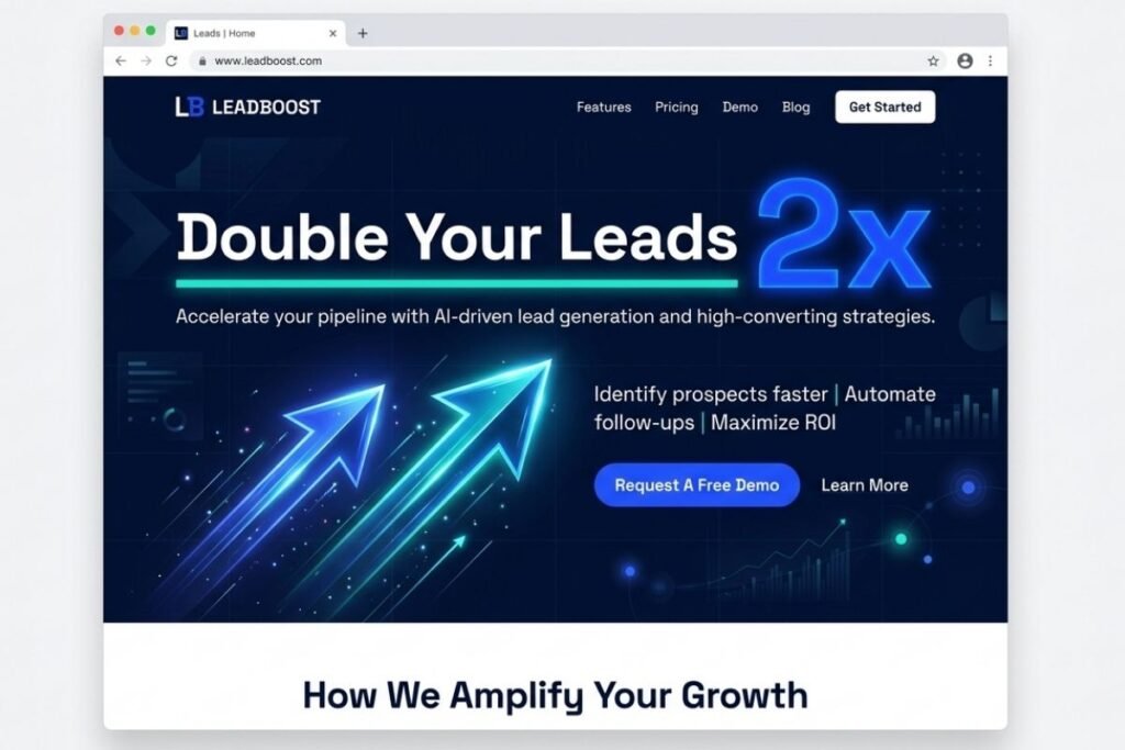
A website that looks like it hasn’t been updated since 2015 doesn’t just feel dated — it silently tells every visitor that your business may be equally behind the times. Modern website design is the deliberate fusion of contemporary aesthetics, user‑centred UX, performance engineering, and conversion architecture — all calibrated to turn passive browsers into active leads. When executed well, it doesn’t just improve bounce rates or time‑on‑page; it can literally double the number of inquiries, sign‑ups, and demo requests your site generates, often without increasing your traffic at all.
At Webtoz, we’ve redesigned websites for SaaS companies, professional services, and B2B technology firms that saw their lead volume jump by 80–120% within the first months of launching a modern, strategically re‑engineered website. The secret isn’t a single trick — it’s the systematic application of proven design principles that align with how today’s users search, scan, and decide. In this guide, you’ll learn exactly which elements of modern design drive that dramatic lift, the psychology behind them, and a step‑by‑step process to modernise your own site. For a foundational overview of conversion‑focused web building, read our ultimate guide to building a website that sells.
By the end of this article, you’ll have a clear understanding of the modern design elements that directly influence lead generation, how to avoid the mistakes that hold back conversions, and a practical roadmap to execute a modern redesign. For a deeper dive into fixing specific conversion killers, also see our post on 10 web design mistakes killing conversions.
📖 In This Guide
- What “Modern Website Design” Actually Means
- Why Modern Design Directly Multiplies Leads
- The Core Elements of a Lead‑Generating Modern Website
- Element 1: Blazing‑Fast Performance & Core Web Vitals
- Element 2: Mobile‑First, Intuitive User Experience
- Element 3: Cohesive Visual Branding & Storytelling
- Element 4: Trust Signals, Social Proof & Transparency
- Element 5: Persuasive Calls‑to‑Action & Conversion Copy
- 10 Outdated Design Habits That Suppress Leads
- How to Modernize Your Website for Double the Leads (Step‑by‑Step)
- Final Thoughts: Invest in Modern Design, Harvest Leads
1. What “Modern Website Design” Actually Means
Modern design is often misconstrued as “minimalist with lots of white space.” While those can be characteristics, true modernity is functional. It means a website built on current web standards — fast, accessible, responsive, visually coherent, and engineered to anticipate user intent. It employs clean typography, strategic micro‑interactions, and a design system that scales. More importantly, it prioritises the user’s goal over the designer’s ego, removing friction at every step. For a detailed breakdown of modern visual and verbal consistency, see how a cohesive brand identity builds a business.
Performance‑First
Fast load times, optimised assets, and clean code are no longer extras — they are baseline expectations.
Intrinsically Responsive
Fluid grids, flexible images, and touch‑friendly interfaces that feel native on any device.
Conversion‑Centric
Every layout decision, from hero section to footer, is guided by the primary goal: turning a visitor into a lead.
2. Why Modern Design Directly Multiplies Leads
Leads are the lifeblood of most businesses, and the primary place they are generated — or lost — is your website. Modern design influences lead volume through three interlinked levers: trust acceleration, cognitive ease, and friction removal. A modern site establishes credibility in milliseconds, presents information in an easily digestible format, and makes the next step irresistible and effortless. When you upgrade from an outdated, slow, cluttered site to a modern, streamlined experience, it’s not unusual to see conversion rates jump from 2% to 4% or more — effectively doubling leads from the exact same traffic.
Instant Credibility
75% of users judge a company’s credibility based on web design. A modern, professional look signals competence immediately.
Reduced Cognitive Load
Clean layouts with strong visual hierarchy help users process information faster, leading to quicker decisions to engage.
Friction‑Free Actions
Obvious CTAs, simplified forms, and fast performance remove barriers between interest and conversion.
Can a redesign really double leads, or is that just marketing hype?
It’s real, but it depends on the starting point. If your current site is severely outdated, slow, or confusing, the uplift can exceed 100%. Even a site that’s “okay” can see a 30–60% increase by optimising performance, simplifying CTAs, and modernising the user flow. The key is to pair visual modernisation with conversion‑focused engineering, not just a cosmetic facelift.
How long does it take to see results after a modern redesign?
Lead improvements can be visible within days if the redesign fixes major friction points. However, because a redesign often involves new URLs, redirects, and updated content, there may be a brief SEO transition period of a few weeks. After that, the combination of better user experience and improved technical SEO typically accelerates both organic traffic and conversion rates.
3. The Core Elements of a Lead‑Generating Modern Website
Through our work at Webtoz, we’ve identified five non‑negotiable elements that characterise a modern, high‑converting website. Master these, and your site becomes a lead generation machine.
1. Speed & Performance
Sub‑2‑second load times and flawless Core Web Vitals keep users on the site and moving toward conversion.
2. Mobile‑First UX
A flawless smartphone experience, because that’s where the majority of first impressions happen.
3. Visual Storytelling
Cohesive branding and narrative that communicate value at a glance and evoke the right emotions.
4. Trust & Social Proof
Testimonials, certifications, and transparent contact info that dissolve hesitation.
5. Persuasive CTAs
Action‑oriented, high‑contrast buttons placed at natural decision points throughout the journey.
4. Element 1: Blazing‑Fast Performance & Core Web Vitals
Modern design is inseparable from performance. Google’s Core Web Vitals — Largest Contentful Paint (LCP), First Input Delay (FID) or its replacement Interaction to Next Paint (INP), and Cumulative Layout Shift (CLS) — are not just SEO factors; they directly impact user experience and conversion. Sites that load in under two seconds have significantly higher conversion rates than those that take three or more. A modern site achieves this through optimised images (next‑gen formats), efficient code, content delivery networks, and lazy loading. For a full performance audit checklist, our website optimisation services cover every technical layer.
5. Element 2: Mobile‑First, Intuitive User Experience
Over 60% of web traffic originates on mobile devices, and that number is even higher for local business queries and B2B research done on‑the‑go. A modern site starts with the smallest screen and expands, not the other way around. This means simplified navigation, large tap targets, condensed forms, and content that is effortlessly scannable. Mobile‑first design also improves accessibility and SEO, as Google indexes the mobile version of your site. For a deep dive into mobile UX best practices, refer to our guide on building a website that sells.
Thumb‑Friendly Navigation
Key links and CTAs placed in the natural thumb zone, with generous spacing to prevent mis‑taps.
Condensed, Smart Forms
Only ask for essential information; use input masks, dropdowns, and autofill to speed up completion.
Click‑to‑Call & Maps
Instant actions — tappable phone numbers and embedded maps — reduce friction for mobile users ready to convert.
6. Element 3: Cohesive Visual Branding & Storytelling
A modern website doesn’t just display information — it tells a story. Through a consistent colour palette, modern typography, purposeful imagery, and a clear brand voice, it creates an emotional connection that generic templates cannot. Visual storytelling guides the visitor from “What is this?” to “I need this” without feeling like a sales pitch. Each page should have a narrative arc: the hero introduces the problem, the following sections present the solution and proof, and the CTA offers the logical next chapter. Our article on how a cohesive brand identity builds a business expands on the strategic role of design.
Consistent Design Language
A unified colour system, typography scale, and component library create a seamless, professional feel.
Authentic Imagery
Custom photography, custom illustrations, or carefully curated brand‑aligned imagery that differentiates you from competitors.
Copy‑Driven Narrative
Conversion copy that speaks directly to pain points and desired outcomes, aligned with the visual hierarchy.
7. Element 4: Trust Signals, Social Proof & Transparency
A modern website understands that leads are earned through trust, not tricks. It prominently features client logos, case studies, video testimonials, industry certifications, and transparent contact information. It displays a clear privacy policy, secure SSL certificate, and an up‑to‑date copyright date. All these subtle signals combine to reduce the perceived risk of engaging with your business. For local businesses, integrating GBP reviews is especially effective — see our guide on how proper Google setup fuels growth.
Case Studies & Metrics
Specific results — “increased leads by 120%” — are far more convincing than generic praise.
Video Testimonials
A short clip of a real customer speaking authentically is one of the most powerful trust‑builders available.
Security & Compliance
SSL padlock, privacy policy, and GDPR/CCPA compliance badges signal that you handle data responsibly.
8. Element 5: Persuasive Calls‑to‑Action & Conversion Copy
The final pillar of a lead‑doubling modern website is the strategic placement and wording of CTAs. Modern design uses contrasting button colours, benefit‑driven copy (“Get Your Free Quote” vs. “Submit”), and positions CTAs at natural conversion points — after a value proposition, a case study, or a key benefit list. It also employs micro‑copy around buttons to reduce anxiety (“No credit card required,” “We’ll respond within 24 hours”). A/B testing these elements can yield significant incremental lifts, and the modern tech stack makes testing easier than ever.
High‑Contrast Buttons
The CTA must visually dominate the page; using your brand’s accent colour exclusively on CTAs reinforces this.
Action + Benefit
“Start My Free Audit” combines the action with what the user gets — far more effective than “Click Here.”
Contextual Placement
Place a CTA after every major section that makes a compelling case — don’t make users scroll back up to act.
9. 10 Outdated Design Habits That Suppress Leads
Even if your website was built just a few years ago, design trends and user expectations have evolved rapidly. These ten anachronisms silently kill your lead flow. For a more detailed fix guide, see our post on 10 web design mistakes killing conversions.
- 1. Flash‑Based or Outdated Animation: Relies on deprecated plugins that don’t work on mobile; replace with subtle CSS or SVG animations.
- 2. Tiny, Unreadable Font Sizes: Body text below 16px strains eyes on mobile; modern sites use generous, accessible typography.
- 3. Cluttered Sidebars & Widgets: Outdated sidebars with tag clouds, calendars, and excessive links distract from the main conversion path.
- 4. Auto‑Playing Background Music: Universally hated; modern design respects the user’s audio environment.
- 5. Stock Photos of “People in Suits Shaking Hands”: Generic, staged imagery erodes authenticity; real photos build connection.
- 6. Splash Pages or Unnecessary Intros: Adding a gate before the homepage increases bounce rate; modern sites get straight to the value.
- 7. Overuse of Carousels / Sliders: Multiple messages compete; often the first slide is the only one seen, and they slow down the page.
- 8. Pop‑Ups That Appear Instantly: Interrupting the user before they’ve consumed content is a conversion killer; modern pop‑ups are timed or triggered by exit intent.
- 9. Hidden Navigation (Mystery Meat): Users shouldn’t have to hunt for basic links; clear, descriptive menus are a hallmark of modern UX.
- 10. No Social Proof or Trust Badges: A site without testimonials, reviews, or certifications forces visitors to gamble on your credibility.
How to Modernize Your Website for Double the Leads
Follow this step‑by‑step process to transform your outdated site into a modern, lead‑generating powerhouse.
1. Benchmark Current Lead Metrics
Measure your current conversion rate, bounce rate, and lead volume per month. Set a specific goal (e.g., double leads from organic traffic in 6 months).
2. Run a Performance & UX Audit
Use Google PageSpeed Insights, heatmap tools, and user session recordings to identify speed bottlenecks, navigation issues, and drop‑off points.
3. Redesign with a Mobile‑First, Conversion‑Centric Approach
Create wireframes starting from mobile, ensuring the value proposition and primary CTA are immediately visible on every key page.
4. Overhaul Visual Branding & Imagery
Implement a modern colour palette, updated typography, and replace all generic stock with authentic, high‑quality brand visuals.
5. Optimize Every CTA & Form
Rewrite CTA copy to be benefit‑driven, reduce form fields to the absolute minimum, and add trust micro‑copy near submission buttons.
6. Launch, Measure, and A/B Test
Deploy the new design, closely monitor analytics for the first 2–4 weeks. Run A/B tests on headline variations, CTA colours, and page layouts to further refine.
10. Final Thoughts: Invest in Modern Design, Harvest Leads
Doubling your leads rarely requires doubling your traffic. More often, it requires modernising the experience your current visitors encounter — so that a higher percentage of them trust you, understand your value, and take the next step. A modern website design that merges performance, UX, visual branding, trust signals, and persuasive CTAs is not an expense; it’s a lead‑generating asset with measurable ROI.
At Webtoz, we specialise in that intersection of design and engineering. We don’t just make websites that look contemporary; we architect them to convert. If you’re ready to discover how a modern redesign can transform your lead flow, explore our services and pricing, read more about our approach in digital creation services, or contact us to start the conversation. Your next wave of leads is waiting.
About Webtoz Solutions Team
Webtoz is a premium web development, software engineering, and technology consultancy. We design and build modern websites that double leads by combining strategic design, technical performance, and conversion‑focused engineering. Learn more about us, or get in touch to discuss your modern website project.
Ready to Transform Your Website into a Lead‑Generation Machine?
Let Webtoz design a modern, conversion‑focused website that turns your traffic into a steady stream of qualified leads. Start your project today.
Get in Touch →